Normally I keep a running list in my head of all the great brands I come across day-to-day, since good logos and good logotypes stand out to me. That list is long, and maybe one day I’ll blog about some of the best logos you can find driving around the United States. But I keep a secondary list in my head too: All the great logos I see that are very clearly derived from a particular corporate logo, one that changed the landscape of all corporate logos and the direction of corporate branding as a whole after 1960.
The number of corporate identities you’ll see throughout the day that are essentially directly inspired by this one trailblazer is enormous. Its influence is immediate and obvious. But like all great and influential things, so much of the current landscape has now derived from it you might not recognize how novel it was at the time and how foundational it turned out to be. You might think it’s just another derivative.
Corporate branding up until the second world war was generally an exercise in being overly ornate. It was a very literal practice. It was the kind of thing where the owner of the company would say “We need a brand identity, let’s see how many uniquely identifiable features we can pack into one single sheet of paper… Perfect. That’s the logo.”
 Yikes
Yikes
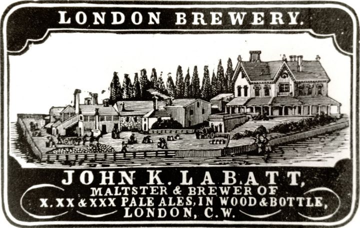
If you ran a brewery, let’s say, before World War One, and someone asked “What should we put on our beer wagons?” you as the owner would probably say “Let’s have some artist draw our entire brewery, maybe sketch some big huge scrolls on top and bottom of it, all very ornate, and it’ll say Wolfgang Herzel’s Beer Brewery, Established Milwaukee Wisconsin, 1887, We Brew The Finest Lager… That’s Our Guarantee!” It’d be a mess. Usually the words would be in handwritten calligraphy. The undertone to all of it was, essentially, “We’re fancy, because we can afford the biggest calligraphy nibs! The finest hand-drawn craftsmanship! Look at this picture of a BUILDING we own. We own a BUILDING.”
And that was the prevailing sense of the day. And it really did derive from the earliest brands, and the earliest ways to differentiate abstract things from other things. Heraldry, family crests and the like would be an early and obvious example. Literal objects, emblazoned on expensive things like shields and tapestries, were how you built an identity for your family and showed the world how rich you were. And that tradition, a gaudy and ornate display of worth, could be traced straight through to the British East India Company of the early 1600s, which I’d argue represents the birth of modern corporate branding (at the time it was common practice to brand their shipping crates, which is literally where the word “brand” comes from in this context).
And that tradition continued through the interwar period. “We need to stick more and more things here to show how fancy we are.” “We are essentially royalty, and very specifically White-European royalty, behold our civilized handwriting and fine motor skills.”
So it’s against that backdrop that we start seeing people in the Postwar era, in the late 1940s and 50s, starting to break away from that. Designers began considering branding as more an exercise in practicality. Logos that could work in different media were increasingly valued, logos that could be recognized more quickly, as people moved faster (literally and figuratively).
And into this world is born the Chase logo.
That’s right, I’m arguing the Chase logo is the greatest expression of corporate branding we’ve ever seen, and possibly ever will see.
Chase, and banking as a whole, is extremely bland and before 1960 their corporate identities matched that blandness. Their official name, Chase National Bank Of The City Of New York, was long, their logo was a globe that said “Worldwide Banking” superimposed over a stretched outline of the United States. A perfect encapsulation of the type of garbage corporate identity that saturated the United States at the time. But in 1959, the executives of Chase decided to contract the Chermayeff&Geismar firm to radically rebrand. And keep in mind New York in the late 1950s is where color field painters and abstract expressionists were turning the art world on its head, with Newman and Pollock and Rothko having pushed the boundaries of what art even was. And into this world Chermayeff&Geismar pushed the boundary of what a corporate logo could be.
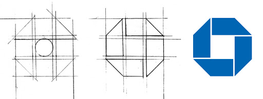
What they proposed was nothing short of appalling to the corporate world at the time. They proposed that the Chase identity would no longer be tied to a drawing of literal objects. It would no longer be something so representative of physical banking. Instead it would be simply this: An octagon. With a square punched through. And four lines, each one emanating from a corner of the square. And that was Chase.

Their typesetting was just going to be a simple, open sans serif font, left-justified. It would just say “The Chase Manhattan Bank”. The end.
No more drawings of buildings. No more scrolls with handwritten calligraphy and drawings of three-headed eagles holding arrows or whatever. This was taking the entire history of corporate logos becoming more and more ornate, and just wiping it clean off the table. Like when someone tries to do that thing where they pull the tablecloth out from under a set table and fails, and just everything crashes down. Except the Chase logo did that on purpose.
And a lot of people said at the time, and maybe even still today: “How does this octagon with a square space in the middle mean Chase? How does an abstract shape represent a bank? Isn’t this just some random shape?”
No, if it were just a shape that meant nothing, it wouldn’t have caught on.
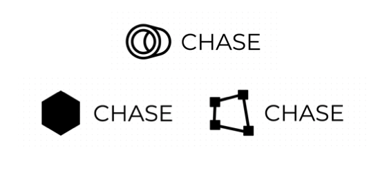 Random shapes suck.
 This one doesn’t
Take a look at that symbol. It certainly isn’t representing anything physical. But I feel like it represents a lot abstractly. It represents a lot of ideas.
It gives the impression of a single strip being folded over itself. It looks almost how you’d imagine a long strip of material would be if it folded over itself four times. And in that sense you notice there are no discontinuities. Almost like a Möbius strip, it seems to have no ends. But, in contrast to that sense of longevity, it does seem to be tightly bound, giving a sense of security, or organization, without constraining it so much that it becomes small. It’s still an infinity, it’s just one that’s been carefully arranged.
And the impression of security it gives (like a bank vault), in concert with the idea of a limitless strip (like you might see in a bank ledger for instance), I think is what gives the Chase logo its bearing. It gives the logo its relationship to Chase bank.

There were a bunch of logos that tried to copy this, of course. Like I said, it was radical at the time but soon became commonplace due to its success. Walmart, Arco, Boeing, we see that much of modern logo design is basically just recreating the Chase logo while changing up a few variables. And while you might look at the Walmart logo and think it’s not particularly radical or impressive, or maybe doesn’t do a great job of encapsulating the idea of Walmart, it would never have been possible without corporate logo designers feeling confident in creating abstract shapes to replace these overwrought and absurdly practical icons that the Chase logo wiped off the face of the Earth.
Thank you, Chase. You did us all a favor.