More than the packaging, the price, or even the product itself, a company is perceived as “premium” only if all of their interaction points speak to their messaging. Think of a premium brand right now; I bet you can recall a shitty product released by that company. But, somehow, this didn’t change your opinion of the entire brand. Why?
The answer is that positive, premium branding is engrained at a deeper level than any individual touch-point: It must encompass all touch-points. Every experience your company provides is capable of destroying that. The branding giants at IA put it this way:
Branding doesn’t start with the logo. It is not primarily a visual discipline. Your brand is what you stand for. Branding is more about content than shape. It is who you are, not how you look. The shape should represent your inside, your content. Your brand architecture is your information architecture.
So, no, branding isn’t just a sheen you slather on top of a company. It must pervade every experience your company provides. And, I hate to break it to you, but your web app may be the quickest way to sabotage your carefully crafted brand strategy. I’m listing the six worst UX offenders below: Allowing any of these awful, awful mistakes to live on your site will put you on the fast-track to the brand graveyard.
Conversely, even if you don’t manage a brand or a front-end app, be on the lookout for these in your daily life. They’re all dead giveaways that the company you’re dealing with is probably full of shit.
1. Discount interruptors
Christ almighty, why is this a thing? Why, in 2015, is this a thing? How can a brand with any self-respect think this is okay to implement?
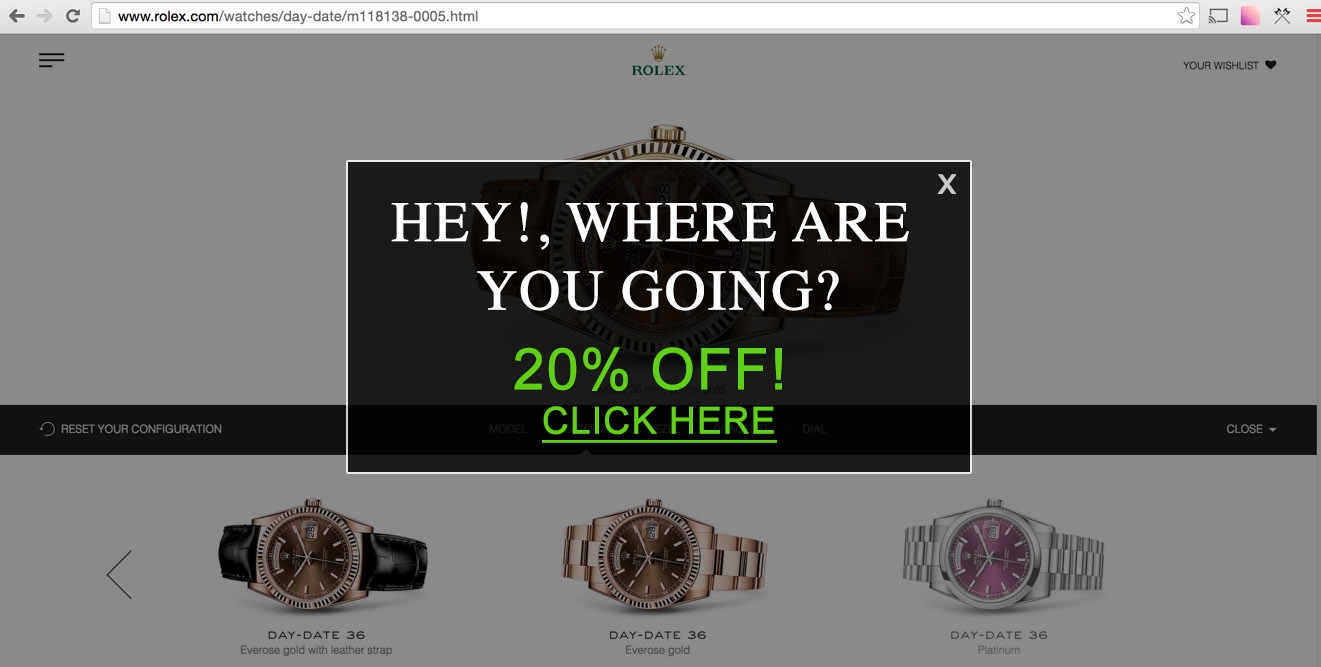 Imagine if a premium brand, like Rolex, implemented this garbage
Let me paint the hypothetical picture for you. You’re researching Rolex watches. You’re crafting a $20,000 heirloom to be passed down to your children, and your children’s children. Suddenly, Rolex.com hits you with the interrupting modal seen above. You took too long on the page, or moved your mouse towards the top of your browser, and the site thought you were leaving. So it offers you a discount. A fucking discount. Because they thought you were leaving.
Offering a discount to someone because they lingered on your page or moved to close a tab is a massive, unmistakable sign that your product is not worth its price tag. You’ve exposed that your baseline pricing is marked up by a significant amount for no discernible reason, and that your company is okay with charging some people extra and some people less for no other reason than hey, they’ll pay for it. This is invariably toxic to the perception of your entire brand.
2. The word “premium”
Premium isn’t something you’re allowed to call yourself. It’s an empty word, when self-applied. If a company is describing itself, or its product, as “premium”, that just means they have nothing else to say about it. It’s completely meaningless. Jodi Lastman has a great piece about empty talk on the Hypenotic blog, which uses a real-life example of a chef calling out Anthony Bourdain on his use of an empty phrase:
Anthony: (defending Italian cooking) “It’s ingredient driven food….”
Wylie: “Ingredient driven food. What the fuck does that mean?”
Anthony: “Okay, it means taking three or four pretty good ingredients or very good ingredients or superb ingredients and doing as little as possible–”
Wylie: “It’s called cooking... Get good ingredients and cook it. It’s called cooking. Are you crazy? Who’s like ‘I’ve got some shitty stuff, let’s cook it’? Everybody wants good ingredients. Ingredient-driven doesn’t mean anything. That’s what good cooking is!”
If you see a product that describes itself as premium, substitute that word with basic. Because that’s what it is.
3. Hijacking basic user actions
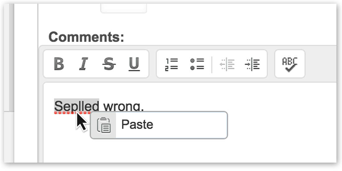 This is what happened when I right-clicked in this textarea. If you aren’t mad, you aren’t human.
Good lord, look at this nonsense. Hijacking a basic user action, like right-clicking or closing a tab, is a critical error in judgement. It conveys, loud and clear, that your user experience managers are grasping at straws, and think an immersive web experience means they must control everything you do. “Let’s transport the user to another dimension, where they live exclusively in our world-wide-webpage!” is the implied calling card of a flailing, out-of-touch brand that implements tone-deaf mouse hijacking.
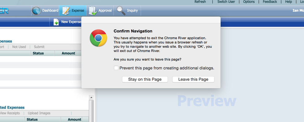 “Let’s transport the user to another world, where they ONLY HAVE ACCESS TO OUR APP” —Some Idiot
It’s closing a tab, for the love of god, you don’t need to control that experience. On rare occasions, with single, mission-critical working areas, it might be acceptable to offer a save point on tab-close. But it needs to be thoughtful, extremely limited, and, ideally, configurable to never ask again. Never convey thoughtlessness or, worse, that you think your user is stupid. That’s the opposite of premium.
4. “Call us for pricing”
If SpaceX can publish their pricing for going to space, your little SaaS does NOT need "Contact us for pricing" http://t.co/5HIKkwhgMN
— Dan Harper (@DanHarper7) September 15, 2015We get it. You think withholding pricing information will bait a customer into calling or emailing you, so then you can really hard-sell ‘em the goods, right? They’re all a bunch of simpletons anyway, and won’t fully comprehend the vast value of your offering without some good old-fashioned, comission-driven haggling!
Stop treating potential customers like they shouldn’t have access to some information, acting like you’re afraid they’ll get scared away. What are you, a mid-century car salesman? This is 2015, and if your product is worth what you charge, you shouldn’t attempt to withhold that information. I say “attempt”, because they can just type your product name plus the word “price” into Google and figure out what it costs in fifteen seconds, you dolt.
5. A/B testing entirely different products on a page
“A/B testing”, the practice of admitting you crowdsource your UX design decisions, has a fair amount of traction in the front-end community. If your web property serves many hundreds of thousands of impressions per minute, per hour, or even per day, a conversion improvement of only a few percentage points can make the difference between your boss giving you a raise or not.
But beware!, this isn’t a golden ticket to free money. For sites that don’t sell more than a few hundred units a day, the relative advantages of A/B testing rarely outweigh other conversion-improvement tactics, like, I don’t know, a better product, better prices, or clearer communication. A/B testing entirely different products on one page also has a massive, often-overlooked disadvantage: Customers notice.
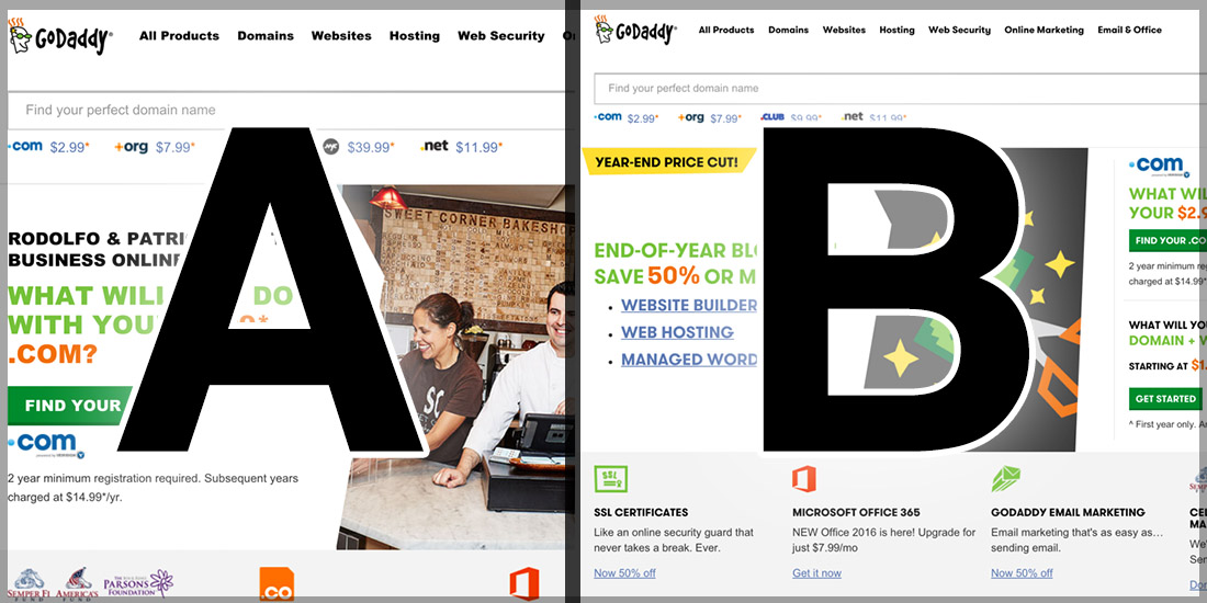 “I’m sure customers won’t talk to each other and find out we have forty different homepages!”
Customers notice, plain and simple. They notice if they visit the page later, or from another device. They notice when they bookmark and send the URL to a friend, who has to figure out “why the page doesn’t look the same for me.” If a customer ever notices, for any reason, the impression is loud and clear: “This company is doing something fishy.” A premium brand is confident, unshakeable, and doesn’t play for micro-percentage points. While A/B testing small things isn’t a red flag for users, a totally different page or offering most certainly is. Proceed with extreme caution.
6. Obvious SEO babble
Nothing says you don’t care about a user quite like a big chunk of “Search Engine Optimized” keyword copy on your site. Ever since the snake oil salesmen of the SEO industry learned Google’s search algorithms care about content, they’ve been heavy-handedly wedging filler copy into otherwise beautiful websites, sending a clear message to the user: We don’t really care about your experience on this page, we just need to manipulate Google’s search results to get more money.
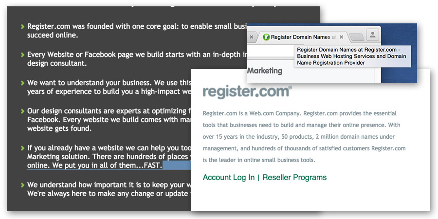 "We care more about trying to trick Google robots than presenting you with a delightful experience."
Cut the nonsense. Your product will go viral, and be successful, whether you trick Google’s search algorithm or not. Think of a few of the most successful tech products in your field. Did they roil the industry, disrupt inefficient business patterns, and deliver delightful and brilliant experiences? Or did they just fuck with Google’s crawler bots enough to justify treating their customers like illiterate dollar signs? I’m guessing the former.
Always remember this: A premium brand is the sum of every interaction it curates. Chasing revenue must be done within the parameters of a company’s brand strategy. Simply put, there are no silver bullets. If you don’t follow this guideline, you’ll quickly find your brand on the outside looking in.