Most people are presented with important font decisions maybe only three times in their lives: When the wedding invitation designer asks you to pick one from a display; when the tattoo artist asks you to pick one out of a binder; and when you’re making your résumé and have to pick one out of a dropdown menu. Understandably, a lot of people feel overwhelmed here.
It’s different for me. I work at a type foundry—a company that makes fonts. I walk through Manhattan every day attempting to identify every single font I see. My friends have asked me to help them pick fonts for wedding invitations, tattoos, and—of course—their résumés. For me, it’s great to finally make use of my unusual passion.
So if you’re looking for résumé font advice, hopefully I can help you out a bit. After all, I managed to get hired after sending my résumé to a type foundry. Additionally, throughout my career I’ve gone through dozens—maybe hundreds—of job applications, deciding which ones to call back for an interview. So I’ve got a bit of experience in the field. Here’s what you should know.
Avoid The Following Fonts:
- Arial
- Bank Gothic
- Calibri
- Cambria
- Comic Sans
- Gill Sans
- Impact
- Papyrus (or Parchment)
- Tahoma
- Times New Roman
- Verdana
- …And anything that appears “hand-written”
These fonts are extraordinarily popular, but look terrible on résumés. For some, like Times New Roman and Tahoma, they’re just ugly, and will subtly detract from your document’s overall quality of voice & tone. Others, like Calibri and Gill Sans, are simply the recognizable defaults for major operating system word processors, and your application will have a tangible “seen it before” inconspicuousness everywhere it goes. And of course, faux-hand-written fonts like Comic Sans and Papyrus are ugly, inappropriate and an easy way to ensure you won’t get a call back.
So with those out of the way, what fonts should you use?
You Should Buy a Font, Probably
Buying a font is so far outside most people’s day-to-day experiences I might as well have just told some of you to commandeer the Space Shuttle. But hear me out: Some of the world’s greatest fonts are under $50. You can buy just the styles you need (bold, italic, etc), instead of the entire family, saving tons of money. And if you use a purchased font, you’ll be submitting a résumé with a professional voice & tone that no one else who’s applied for that job has ever used. Even if the person reading your résumé isn’t a designer, they’ll know something is tangibly unique about your document. Really.
If you can’t or won’t buy one, at least spend the few minutes to download a free one. It probably won’t be quite as unique or comprehensive as a non-free typeface, but at least it’ll stand out a bit. In my recommendations below I’ll always include a few free alternatives, and a link to download them.
Pick a Font That Suits You
Your résumé needs to be tailored to you, and the industry you’re in. A lawyer’s CV will be very different from a designer’s folio, for instance. And since I can’t really cover all possible professions, I’ll just cover some major styles of fonts, and list the professions I think they’re well-suited for.
1. Traditional serif fonts
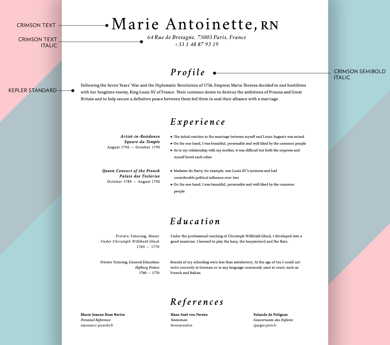
Serif fonts, those stately and elegant old-style typefaces, generally evoke a more refined and traditional sentiment in readers. Of course, serif is an enormous category of fonts, and you could reasonably split them into 10 or 20 subgroups that have distinct and varying appeals. But, generally speaking, old-world professions should consider serifs first and foremost. Careers in law, government, healthcare, education, finance, research, and executive & business sectors generally benefit from a time-honored serif font. Some good, all-purpose serifs I like for résumés are:
Non-free:
- Minion Pro [$$]
- Chronicle Text [$$]
- Kepler [$$]
Free:
Maybe already on your computer:
- Adobe Caslon (not Big Caslon)
- Garamond (or Adobe Garamond)
Again, I recommend paying for one of these. It does make a difference!
Now, it’s possible to use one of the above fonts and still design an ugly document. If you don’t trust your own eye for design, I recommend checking out some other seriffed résumés for inspiration. Like these fake ones that I just made:

2. Geometric sans-serif fonts
Sans-serif fonts are an impossibly huge category of typeface. They can express almost any conceivable theme; from stately and regal to total goofiness. So I’m breaking these into two entirely contrived subcategories: geometric and informal.
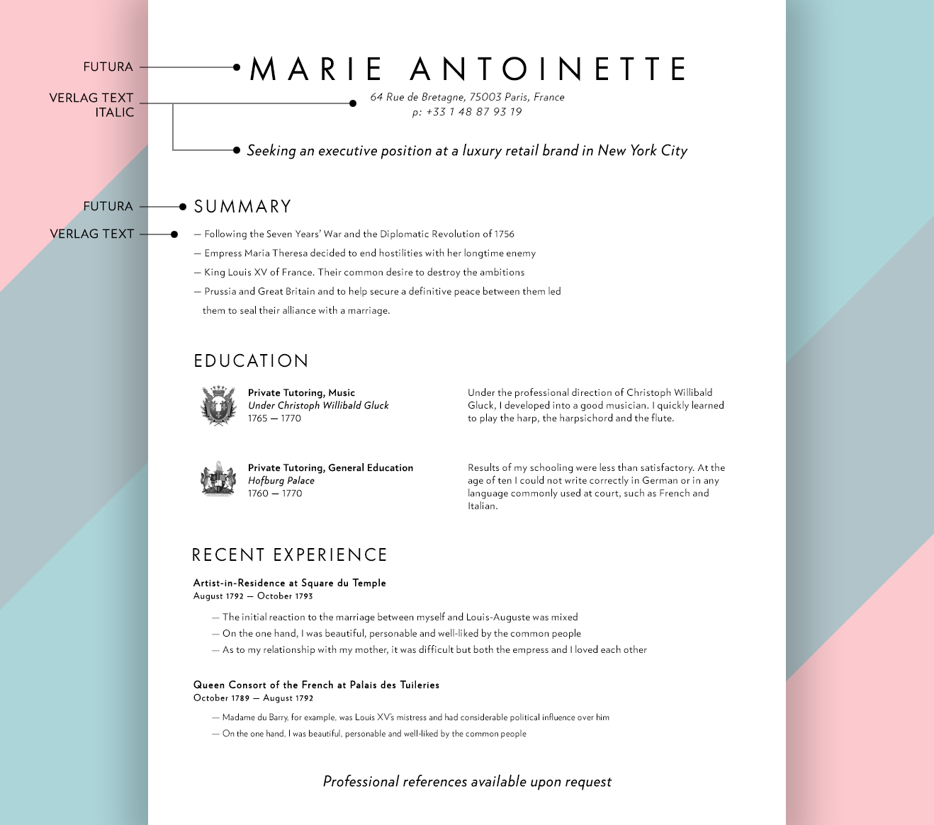
Geometrics might be considered (by the person reading your résumé) a bit more idealized, mid-century or otherwise modernly-styled than other fonts. I love seeing these fonts used for careers in fashion, graphic design, hospitality & leisure, high-end retail, architecture, film & TV production and similar fields. Some well-groomed geometric fonts are:
Non-free:
- Futura [$] (not the Futura that comes on Macs)
- Verlag [$$]
- Neutraface [$$$++]
- Circular [$$$++]
Free:
- Nunito Sans
- Edelsans (careful!, this font doesn’t have bolds or italics)
- URW++ Gothic L
Maybe already on your computer:
- Avenir Next
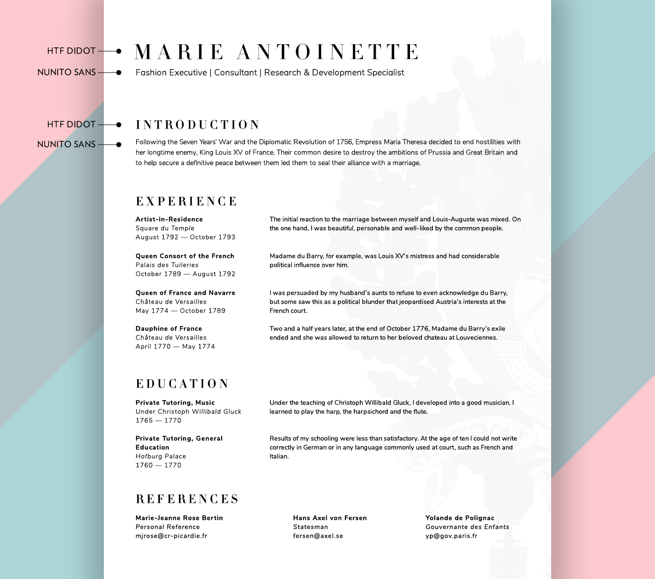
Geometric sans-serifs can get mechanical-looking quickly, so treat these with respect and try not to load the page up with text. They also pair very nicely with Didone serifs, like HTF Didot. Here are a couple of examples for inspiration:
3. Informal sans-serifs
This category of fonts (which I just made up for this article) is certainly the safest choice of typefaces I’m profiling. Highly legible, usually quite friendly and always utilitarian, these font families are a stable and reliable option for almost any professional. For résumés in technology, marketing, and many freelance positions I’d recommend a slightly “quirkier” informal sans-serif:
Non-free:
- Freight Sans [$$]
- Ideal Sans [$$]
- FF Good [$$$]
Free:
- Calluna Sans
- Montserrat (great for headlines/titling)
- Fira Sans
Maybe already on your computer:
- (None)
Pairing these with visual aids and bright colors often works well. See these two examples:


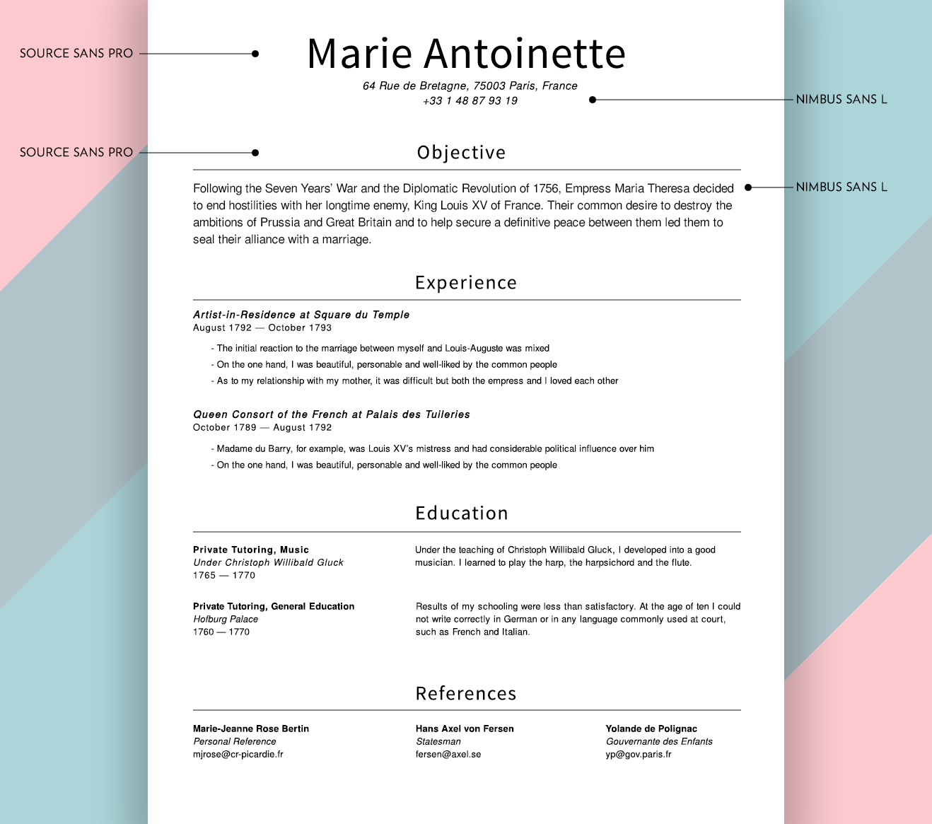
Also in this category are the informal sans-serifs with very little “quirkiness”. These are the safest of the safe and, unfortunately, can also be the most boring of the boring. But, if you pick a non-default font and spend some time adjusting the metrics (like font size, line height, and letter-spacing), as well as picking a harmonious font for your titles, you can design a truly outstanding résumé. I’d recommend these for any conservative profession not listed above. Some decent straight-laced fonts are:
Non-free:
- Akzidenz Grotesk [$$$++]
- Weissenhof Grotesk [$$]
- Frutiger [$$]
Free:
Maybe already on your computer:
- Helvetica Neue
Since making résumés with these fonts is less fun for me, I only created one example. Sorry:
4. Outliers & outsiders
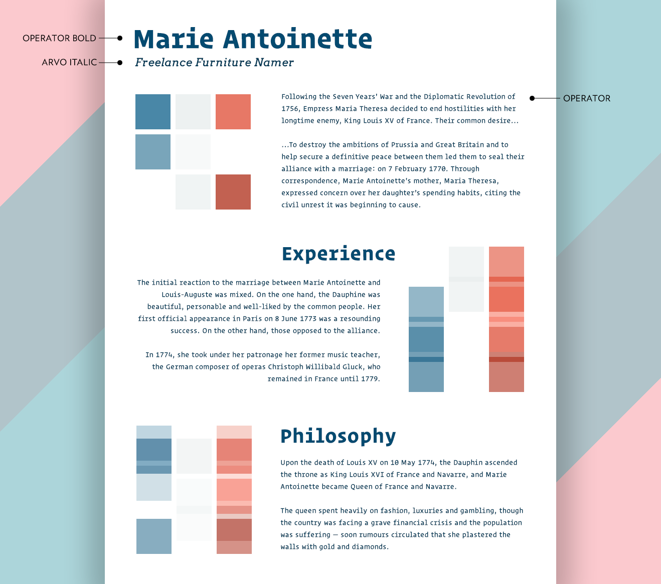
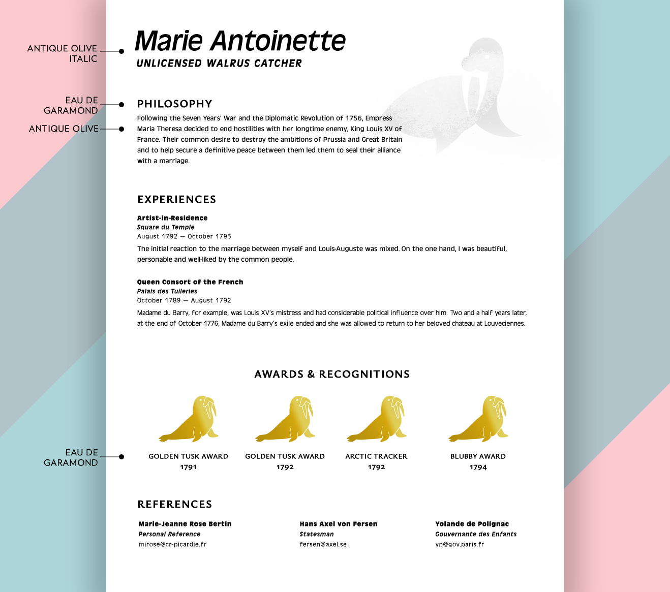
Even though résumés tend to be straight-laced, there are certainly occasions that call for an unusual delivery. If you’re feeling brave, perhaps consider a typeface with very pronounced uniqueness. I’m having trouble coming up with professions that would always call for these, but a few off the top of my head might be: LISP programmers, the people who name IKEA furniture and typographers. If you’re in one of these professions, consider using these well-designed, but certainly eyebrow-raising, typefaces:
Non-free:
Free:
Maybe already on your computer:
- (None)
Be extra careful with these. Too much eye-catching can distract in a major way from your content. Take a look at these for inspiration.
Your Final Decision
Your final choice in font(s) needs to be a personal one. Try a few out—mix a serif with a sans-serif, or a geometric sans-serif with an informal sans-serif—and see which ones feel harmonious to you. Whether you choose one font or multiple fonts, be sure to mix weights (regular vs bold vs ultra bold, for instance) to give a bit of depth to your page.
But above all, be clear and succinct. My résumé was only 17 lines of text, with three references and nine “skills” listed. Your font(s) should reflect that kind of clarity too.
And if all else fails, just ask your designer friends for help. Ideally a designer who’s sent a résumé somewhere and gotten hired.