Each font a candidate chooses tells a unique story about their personality, their candidacy, and, crucially, their ability to delegate decisions they themselves are not experts on. From worst to best, here are my reviews of the six leading candidates for US President, 2016.
6. Donald Trump
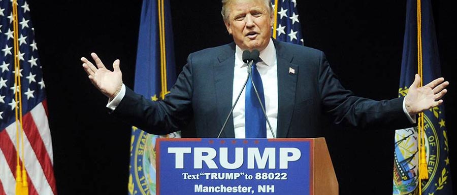
Maybe it’s not surprising who boasts the worst typography, by far, in the race. “The Donald” is quite fond of using Times New Roman and Arial Bold, all-caps. It’s disgusting. Using Arial and Times New Roman, the free “Windows default” fonts of the 1990’s, is a thousand-watt beacon proclaiming that you don’t give a shit. It also reveals you at no point in time hired anyone who ever gave a shit. Arial influences its readers to subconsciously render its content amateur, ham-handed, oafish. Mom-and-pop shops almost invariably use it for their “restrooms for customers only” signs. Using it at this level is very telling.
—Typography score: 0/10
5. Ted Cruz
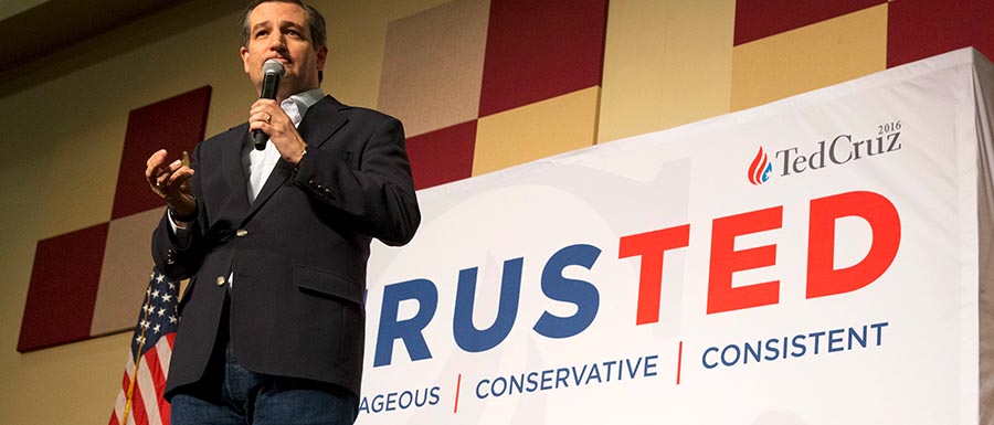
Ted Cruz is honestly all over the map with his typography. A majority of the time his name appears in a classic, no-nonsense serif font called Electra (designed in 1994). Very upright, conservative, sturdy. That makes sense. But it seems most of his rally signage is in Gotham, famously chosen—and subsequently launched into ubiquity—by Barack Obama in 2008. It is progressive, hopeful, and exudes compassion & newness. It does not compliment his serif font; at best, it conflicts with it. At worst, it is a tacit Obama endorsement.
—Typography score: 4/10
4. marcorubio
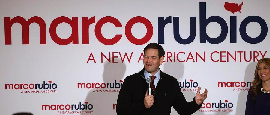
Marco Rubio—or rather, marcorubio—insists on lowercasing his entire name in the overly-geometric sans serif Avant Garde Gothic, designed in the 1970’s. The subconscious reasoning for this is likely that “all-lowercase, no-spaces” is how his name would appear in hashtags, prompting voters to view him as more modern and pervasive than his opponents. This is risky, and I think it backfires, as they pair it with the much more graceful and stately font Futura, making him seem rather squat, angular, and un-engendered. It’s just too soft, too untested, and more becoming of a real estate agent on a park bench ad than a commander-in-chief.
—Typography score: 5/10
3. Hillary Clinton
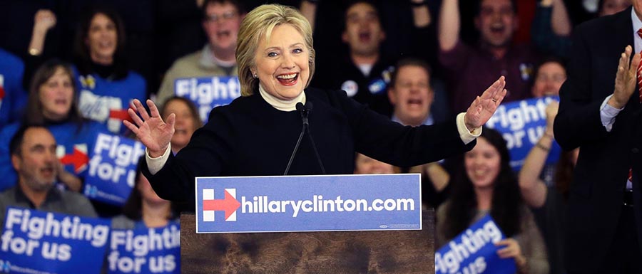
Hillary commissioned a custom typeface based on Sharp Sans and named it “Unity”. It’s geometric, but with humanist ornamentation. Clinton added big friendly tails on the lowercase, and rounded the joins and dots, giving it a contrived friendliness that smacks of design-by-focus-group. It wants to be hopeful and non-cynical, like Obama’s choice of Gotham was, but instead comes off as slightly forced, perhaps checking boxes instead of transcending them.
—Typography score: 7/10
2. Jeb!

I’m truly blown away by Jeb!’s typography. It’s incredible. His name is always set in a 19th century cut of the immaculate serif font Baskerville, always bold. His campaign materials are always set in the modern, beautiful, mature sans serif Futura. His serif font evokes well-trodden paths, strong lineage, and measured contrast. His sans serif is possibly the most beautiful font ever cut, truly ground-breaking and understated. It’s optimistic but practical. Obama without the idealism. It would play perfectly in the general election. His political machine’s only misstep may have been designing for a typical nomination cycle, instead of a farcical one that’s better suited for Impact, the meme font.
—Typography score: 9/10
1. Bernie Sanders
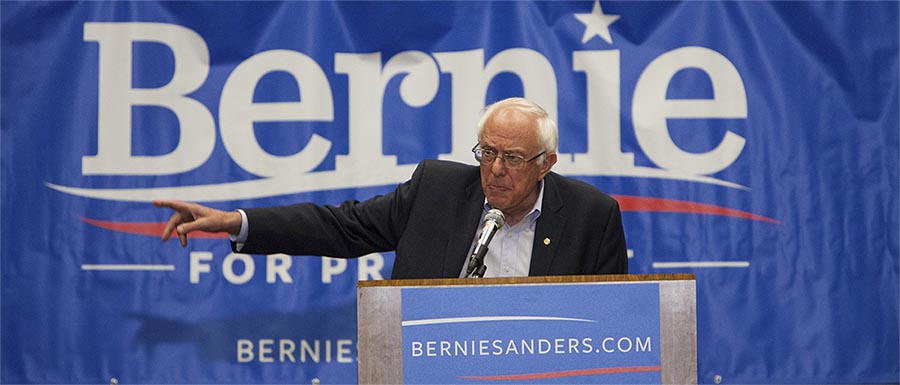
And finally, saving by far the best for last, Bernie Sanders. There’s no other way to put this: His typography is absolutely brilliant. He set his name in a phenomenal modern serif font called Jubilat, designed in the mid-2000’s. The font is modern in its metrics and proportions, friendly and approachable, but it goes beyond that. Its old-dictionary-font flairs and early-80’s-style terminals give it unmistakable “retro” appeal at the same time. The resulting font is hospitable, knowledgable, referential. It’s learned from the past without being stuck there. He pairs Jubilat with the sans serif font Freight Sans, designed by the same studio around the same time. Freight Sans is both clean and familiar, while being totally unique. The end result is masterful. While every other campaign (except Jeb!) is stuck mimicking Obama’s Gotham, Bernie is blazing a totally new, and authentic, trail.
—Typography score: 10/10